How to get different shades of green. How to get green by mixing paints
When decorating the surfaces of walls, furniture and other objects with paint, the question arises of mixing them to obtain the desired color. It is not always possible to find the desired color or shade in stores, so you can use the mixing table. Creating color by hand from scrap paints is also cost-effective.
Features when working with acrylic paints
Acrylic paints are an inexpensive material that is easy to work with and dries relatively quickly. But the disadvantage is the narrow palette of colors, so you need to create the desired shade manually. You can get burgundy, lilac, turquoise, sand, wenge, lilac, and others by mixing colors.
There are some rules when working with acrylic:
- The surface to be painted must be smooth, clean, free of oil and grease stains. It must first be cleaned of the previous finish. It is not recommended to apply a new coat of paint over an old one;
- Before painting, the walls need to be leveled with putty, and then several layers of primer must be applied. The primer is used for better adhesion of paint and for less paint consumption;
- Before use, acrylic must be diluted with water or special solvents, but it is better to do this in a separate container with a portion of paint. This is necessary in order not to spoil the entire volume at once, but to use only as much as needed.
- After use, used rollers and brushes must be rinsed thoroughly with water, otherwise they will become unsuitable for further work. You also need to wash other tools that were used. The top of the paint bucket needs to be wiped down so that the lid can be opened in the future.
- Most often, painting occurs in 2-3 stages, and for an effective result, this must be done in one direction. To simplify and speed up the work, you can take a spray bottle.
Important! Also, do not forget about precautions; before work, it is better to cover or seal all places and objects that will not be painted. You can work with the material at temperatures not lower than 5 degrees and not higher than 27 degrees.
Another main rule of application is to use paint first on a small area or a completely separate surface. When creating the desired shade, it is better to try it on a draft. You also need to wait until it dries completely, as after that the color becomes a little darker or lighter, depending on the type of paint. And if the color matches the expected desired result, then you can start painting the surface or decorating objects.
What colors should you buy?
Tinting is the name of the science that studies mixing styles and obtaining the desired shade. It is this science that helps to obtain lilac color, as well as fuchsia, ivory, sea wave or sea when mixing colors. In theory, to create many colors, it is enough to have yellow, red and blue. But in this case, you can get a narrow spectrum.
To create a wide palette, it is enough to buy the following colors:
- Red;
- Yellow;
- Brown;
- Pink;
- Blue;
- Black;
- White.
These colors are quite sufficient for applying the basic scales. Gold, silver, mother-of-pearl and other additional colors are also used for artistic decoration of drawings.

Mixing Features
You can find out how to mix correctly and get the desired shade by consulting with a specialist in the store when purchasing.
Tip: The main rule of mixing is that you cannot combine dry and liquid colors. They don't match.
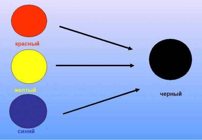
There are 4 main colors - white, red, blue and green. With their help, many others can be achieved. For example, khaki can be obtained by mixing brown and green. And you can get a brown color by mixing from red and green. Beige – take brown and white.
Working with a table
Working with the table is to find the desired color and shade, and next to it in the line, the necessary colors for mixing will be indicated. For example, you can get purple by mixing acrylic paints by mixing red and blue. And to make it light or dark, just add a little white or black color, respectively. The disadvantage of working from the table is that it does not indicate the amount of pigment added - the ratio. Therefore, mixing requires practice and color perception.
Here you can simply take and mix colors, first in the same proportion, and then add another for the desired shade. Or use specialized tables that have been developed by specialists for working with the material.
For example, to get orange when mixing acrylic paints, just mix red and yellow.
Color mixing chart for acrylic paints
|
Image |
Color name |
Required colors |
|---|---|---|
|
Grey |
White and black |
|
|
Plum |
Red, blue, black |
|
|
Light green |
Yellow, white and green |
|
|
Dark-blue |
Blue and black |
|
|
Bordeaux |
Red, brown, yellow, black |
|
|
Dark green |
Green and black |
|
|
Orange |
Red and yellow |
Working with paints is simple, the only difficulty is creating the desired shade, without proportions. But, if you understand the mixing table and practice, and also know the rules of working with acrylic, you can create a unique and inimitable interior design with your own hands and relatively cheaply.
To get purple, you need to mix red and blue, or red and blue containing tones, the main thing is that they do not have a yellow undertone, which, as an additional color to purple, will give a grayish or brown undertone to the resulting paint.
To get purple you need pure colors, and even then the result will be paler than its derivatives, and if you need to lighten and darken the paint, the resulting product will be of the third order and even paler. Based on this, it is better to create shades of purple from the purple paint included in the kit.
How to get purple dye?
Mix red and blue to get dark purple
Bright red and rich, dark indigo result in a dark, almost black purple. Moreover, even diluting it with white, it will reluctantly lighten to a gray-violet hue.
Dark blue “devours” all the lightness and saturation of the brightness of red, and even if we increase the influence of the second (adding red to the resulting violet tone), we will not get purple or rich red-violet, but an almost barely visible eggplant color in its darkening. If you dilute it with white, you get grey-red-violet.

Mix red and blue to create a medium purple
Deep reds and strong blues result in a medium violet, which is much more sensitive to the addition of undertones.
From medium purple you can already get rich plum and its lighter colors:

Mix pink and blue colors to get lilac, amethyst
To achieve lighter yet more saturated shades of purple, the best way to achieve it is to mix warm pink and rich blue, as a result we get a light lilac that is easy to whiten and does not lose much of its expression.

This way you can create a whole spectrum of pastel colors.
Red will help you achieve amethyst tones.

How to create vibrant shades of purple when mixing colors?
All shades of purple obtained using red and blue containing tones do not differ in brightness. Therefore, in a set of 12 colors there is always a bright lilac from which you can build the entire diverse range that the purple palette contains.
A rich, cool dark purple can be created by mixing bright purple and dark indigo.

Rich blue-violet or cornflower blue is obtained by mixing with blue.

Pronounced amethyst is produced from warm pink.

Purple, berry - from the main tone + rich red.

Bright cormorant will be a derivative of lilac + red + indigo.

You should not use yellow and all yellow-containing tones (orange, green, brown, etc.) in constructing shades of purple, since it is an additional color, as a result of mixing which we will get brown.

Light shades are also much more convenient to obtain from the paint available in the arsenal.

It is better not to use black to obtain dark purple shades, as it quickly clogs the shade to dark gray. Dark indigo is more suitable for this.
Table for obtaining purple shades when mixing colors
This table will show you how a color should theoretically behave when mixed with other tones. This will help you navigate your experiments with beauty.


In the center is the color from which the construction is based, around it there are colors that will subsequently be mixed with the main one in the indicated proportions: the first circle of purple flowers are mixed with the front ones in a forgiven ratio of 100% to 50%, the next circle after them: at the end of the beam tint from 100% to 20%, from it the darkened and shaded tones are 20% white and 20% black.
How to get other colors and their shades: theory and practice. Click on the icon.
Knowledge of color mixing options can be useful not only in professional activity artists. Individual design of a living space often poses the question to the designer of how to achieve this or that interesting undertone. The proposed combination options and color mixing table will help you achieve the desired effect.
Everyday life is filled with a wide range of different colors. To get the right one, you need to know the intricacies of combination.
Blue, red and yellow paint are the three pillars on which a wide palette of halftones rests. It is impossible to form these colors by mixing other colors. At the same time, combining them with each other gives an unusually large number of combinations.

Important! You can create a variety of shades by mixing only two colors by changing their proportions.
Depending on the volume of one part of paint added to another, the resulting result approaches one or another original color. One of the most famous examples is the mixing of blue and yellow, resulting in green color. The resulting result, when adding new portions of yellow paint, will gradually change, getting as close as possible from green to yellow. You can return to blue by adding more of the original element to the green mixture.
Mixing chromatic colors that are located close to each other on the color wheel produces a paint that does not have a pure tone, but has an expressive chromatic hue. Combining colors that are on opposite sides of the chromatic circle will result in an achromatic tone. An example is combining orange or purple with green. That is, a mixture of colors located closely in the color wheel gives a rich chromatic shade; the maximum distance of colors from each other when mixed leads to a grayish tone.

When individual paints interact, they give an undesirable chemical reaction, which can result in cracking of the decorative layer. In some cases, the resulting background may darken or turn gray. A good example is the mixture of white lead and red cinnabar. The attractive pink color darkens over time.
It is optimal when the impression of multicolor is achieved by mixing a minimum number of colors. At the same time, it is important to consider which paints, when mixed with each other, give a lasting result, and which ones are unacceptable to combine. The knowledge gained allows us to eliminate paints that fade or darken in the future from work.
The table of unwanted mixtures below will help reduce the risk of erroneous combinations:
Having tried the examples given in practice, future painters and designers will gain valuable professional experience.
Methods for obtaining red and its shades
Red is one of the three primary colors and is necessarily present even in minimal sets. But for mass printing, magenta tone is used. The answer to the question of how to get red is quite simple: mix the proposed magenta with yellow in a 1:1 ratio. There are other options for getting red when mixing paints:


The main red is located in the center. Next are the options for mixing. The next circle is the result of combining the first two colors. Finally, color options are presented when adding red, black or white paint to the final result.

Blue and its shades
Blue is considered a primary color, so to form all its shades you will need blue paint.
Attention! No combination of other colors produces a shade of blue, so the presence of this paint in the kit is mandatory.
Even with a set of 12 colors available, the question periodically arises of how to get blue. The classic tone is called “royal”, and in a set of acrylic paints the main color is often ultramarine, which has a bright dark shade with a purple undertone. A lighter effect can be achieved by mixing blue and white in a 3:1 ratio. Increasing the white leads to a lighter tone, up to a sky blue. If you want to achieve a moderately rich result, dark blue paint is mixed with turquoise.
Let's look at what colors need to be mixed to get shades of blue:
- The effect of a dark blue-green tone is achieved by mixing blue and yellow paint in equal proportions. Adding white paint will result in a lighter shade while reducing the brightness due to the combination of the 3 elements.
- The creation of “Prussian blue” is carried out by mixing 1 part of the main blue and adding 1 part of a composition of bright green and light green. A rich and deep shade can be diluted with white, and its purity will not change.
- Combining blue and red in a 2:1 ratio produces blue with a hint of purple. Adding white allows you to lighten a dark and rich tone.
- Royal blue is distinguished by its brightness; a similar effect is achieved by mixing the main blue with mangento pink in equal parts. An admixture of white traditionally brightens the result.
- Combination with orange gives a gray mass. Replacing orange with brown in a 1:2 ratio to the base creates a dark color with a complex gray-blue tint.
- The formation of dark blue occurs with the help of an admixture of black in a ratio of 3:1.
- You can create a blue tone yourself by mixing the main color with white.
A small table of combination options is presented below:
Green color palette
Solving the problem of how to get green if it is not in the set is quite simple: combine yellow and blue. A rich palette of green halftones is created by changing the proportions of the original components and adding additional elements that perform the function of darkening or lightening. Black and white paint plays this role. The olive and khaki effect is achieved by mixing two main elements (yellow and blue) and a slight admixture of brown.
Comment! The saturation of green depends entirely on the quality of the constituent elements: intense tones of the source materials guarantee a bright result.
If green is obtained by mixing, then all subsequent undertones will be duller. Therefore, it is better to experiment with the range of green if you initially have a ready-made primary color. There are many combination options:
- A combination of equal proportions of blue and yellow produces a grassy green.
- Increasing yellow to 2 parts and adding 1 part blue results in a yellow-green effect.
- An experiment on the contrary in the form of a blue-yellow proportion of 2:1 will allow you to obtain a blue-green tone.
- If you add ½ part of black to the previous composition, you will achieve a dark green effect.
- A light green warm tone is formed from yellow, blue and white paint in a ratio of 1:1:2.
- For a similar light green shade, but a cool tone, you need to take yellow, blue and white bases in a 1: 2: 2 ratio.
- Dark olive color is formed by mixing equal parts of yellow, blue and brown paint.
- The gray-brown tone is obtained from similar elements in a ratio of 1:2:0.5.
The expressiveness of the green color is directly dependent on the original elements; accordingly, the brightness of the halftones is based on the saturation of the green. The graphic palette gives a clear idea of the mixing options:

As in the case of the red circle, the main paint is located in the center, followed by mixing options, then the result of the experiments. The final circle is the shades of the previous level when adding base, white or black paint.

Other combination options
There are many other techniques to create the desired effect by adding some kind of dye to the base color. The answer to the question of how to get ivory color is multifaceted and depends on the surface where you plan to apply the paint. The simplest option is to mix a snow-white base with a yellowish one. For example, yellowish ocher or a minimal amount of strontium is added to white. To tint paper, a small amount of potassium permanganate is diluted in water. A light pink tint indicates a correctly diluted solution. A cotton swab, brush or sponge is moistened with the resulting composition, after which the surface of the paper is treated.
Advice! For double-sided tinting, the sheet can be dipped in a container with a solution of potassium permanganate for a couple of minutes. After drying, it will acquire the desired ivory effect.
There are also several ways to get black:
- by mixing the three basic colors of red, blue and yellow;
- when combining cyan, magenta and yellow;
- a combination of green and red, but the result will not be 100% clear, but only close to the desired effect.
We will try to answer the most popular questions about mixing options:
- How to get raspberry color: the base is blue with the addition of red, white and brown tones.
- You can get turquoise color, whose second name is aquamarine, by mixing blue and green. Depending on the proportions, the tones of the new shade range from soft pastels to intense and bright ones.
- How to get yellow? It is a basic color and cannot be obtained by combining other colors. Something similar to yellow can be created with watercolors by combining green and orange or red. But it is impossible to achieve purity of tone in this way.
- How to get a brown tint? To do this you will need basic paints: red, yellow and blue. First, a small amount of yellow is added to the red (in an approximate ratio of 10:1), then the volume is gradually increased until an orange tone is obtained. After which they proceed to the introduction of the blue element, 5-10% of the total volume will be enough. Minor adjustments to proportions will produce a wide variety of brown effects.
- Combining black and white elements in different proportions gives a diverse range of gray tones.
As you can see, there are options to achieve the desired effect in creative process an innumerable variety of designs. The information presented will be supplemented by a table with options for mixing colors and video:
When you need to mix primary colors and get your favorite purple, green, orange shades, the method of obtaining them depends on many factors. The question is, are you mixing pigments or light? We'll tell you how to work with any materials and share ways to get all the colors of the rainbow!
Steps
Mixing colors: subtractive colors
- Note: Black can be obtained by mixing existing colors. Black pigment, of course, exists, but its use is too conspicuous. It is better to obtain dark colors by mixing transparent primary colors: shadows also have shades, depending on the time of day and other factors.
- Read the "Other Tips" section below for guidance on choosing the best magenta and cyan.
-
Mix red and blue. Everyone knows that red and blue when mixed make purple, right? Indeed, but it's not that bright, vibrant purple. Instead they form something like this:
- Not very pleasing to the eye? This is because red and blue absorb more and reflect less of the spectrum, producing a dark, dirty purple instead of a vibrant and bright one.
-
Now try this: mix magenta with a little cyan and you will see the difference. This time you will get something like this:

- Magenta is a shade of purple, cyan is a blue-green shade, often called royal blue or turquoise. Along with yellow, they are the primary colors in the CMYK model, which is based on a subtractive color scheme (producing color by subtracting individual components from white). This scheme is used in printing, including color printers.
- You can see that using true primary colors - magenta and cyan - results in a much brighter, more vibrant hue. If you want a deeper purple, add more blue. For a deep purple, add black.
-
Mix pigments to create primary and secondary colors. There are 3 main color pigments: cyan, magenta and yellow. There are also 3 secondary colors obtained by mixing two primary colors:
- Cyan + yellow = green
- Cyan + magenta = blue
- Magenta + yellow = red
- Cyan + magenta + yellow = black
- In subtractive color mixing, the combination of all colors produces black.
-
"Read the information below. The Mixing Paints section provides more detailed guidance on how to achieve a wide range of shades, including light, dark and greyish. The Tips section provides an extensive list of colors and combinations you can use to get those colors on your palette.
Light mixing: additive colors
-
Take a look at your monitor. Look at the white areas on this page and get as close as possible. Even better if you have a magnifying glass. When you bring your eyes closer to the screen, you will see not white, but red, green and blue dots. Unlike pigments, which work by absorbing color, light is additive, meaning it works by adding up light streams. Cinema screens and displays, whether it's a 60-inch plasma TV or the 3.5-inch Retina display in your iPhone, use an additive method of mixing colors.
Mix light to create primary and secondary colors. As with subtractive colors, there are 3 primary and 3 secondary colors obtained by mixing the primary colors. The result may surprise you:
- Mixing red + blue = magenta
- Mixing blue + green = cyan
- Mixing green + red = yellow
- In additive color mixing, the combination of all colors produces white.
- Please note that primary additive colors are secondary subtractive colors, and vice versa. How can it be? Know that the effect of subtractive color is a combined process: it absorbs some colors, and we perceive what remains, that is, reflected light. Reflected color is the color of the luminous flux that remains when all other colors have been absorbed.
Modern color theory
-
Understand the subjective nature of color perception. Human perception and identification of color depend on both objective and subjective factors. While scientists can detect and measure light down to the nanometer, our eyes perceive a complex combination of not only hue, but also color saturation and brightness. This circumstance is further complicated by the way we see the same color on different backgrounds.
Hue, saturation and lightness are the three dimensions of color. We can say that any color has three dimensions: hue, saturation and lightness.
- Tone characterizes the position of a color on the color wheel - red, orange, yellow, and so on, including all intermediate colors, such as red-orange or orange-yellow. Here are some examples: Pink refers to a magenta or red tone (or anything in between). Brown refers to the orange tone because brown is dark orange.
- Saturation- This is what produces rich, vibrant color, like on a rainbow or color wheel. Pale, dark and muted colors (shades) are less saturated.
- Lightness shows how close a color is to white or black, regardless of color. If you take a black and white photograph of flowers, you can tell which ones are lighter and which ones are darker.
- For example, bright yellow is a relatively light color. You can lighten it up even more by adding white and making it a pale yellow.
- Bright blue is naturally dark and low on the light scale, while dark blue is even lower.
Mixing paints
-
Follow these instructions to get any color you want. Magenta, yellow and cyan are primary subtractive colors, which means that they can be mixed to create any other color, but they themselves cannot be obtained from other colors. Primary subtractive colors are used when mixing pigments such as inks, dyes and paints.
Low saturation colors (soft colors) come in three main types: light, dark and muted.
Add white to get lighter colors. Any color can be lightened by adding white to it. To achieve a very light color, it is better to add the base color to the white a little at a time so as not to waste excess paint.
Add black to get dark colors. Any color can be darkened by adding black to it. Some artists prefer to add a complementary color that is opposite a given color on the exact CMY/RGB color wheel. For example, green can be used to darken magenta and magenta can be used to darken green because they are opposite each other on the color wheel. Add black or complementary color a little at a time so as not to overdo it.
Add white and black (or white and a complementary color to the original) to create muted, grayish colors.
- By varying the relative amounts of black and white added, you can achieve any desired level of lightness and saturation. For example: add white and black to yellow to get light olive. Black will darken yellow, turning it into olive green, and white will lighten that olive green. Different shades of olive green can be achieved by adjusting the amount of color added.
-
To achieve a desaturated color such as brown (deep orange), you can adjust the hue in the same way as to achieve bright orange - by adding small amounts of nearby colors on the color wheel: magenta, yellow, red or orange. They will make the brown brighter while changing its shade. But since brown is not a bright color, you can also use colors on the other sides of the triangle, such as green or blue, which will darken the brown while changing its hue. Get black.
This can be done by mixing any two colors that are mutually complementary, as well as three or more colors that are equidistant from each other on the color wheel. Just don't add white or any color containing white unless you want a shade of gray. If the resulting black leans too much toward a particular color, neutralize it by adding a little complementary color to that color. Don't try to get white.
White cannot be obtained by mixing other colors. Like the three primary colors - magenta, yellow and cyan - you will have to buy them, unless, of course, you are working with materials like watercolor, for which paper itself is used instead of white if necessary. Develop an action plan.
- Think about the hue, lightness, and saturation of the color you have and the color you want, and make adjustments accordingly.
- One more example. You mixed red and white to make pink, but the pink came out too bright and warm (yellowish). To correct the warm shade, you will have to add a little magenta. To tone down hot pink, add white, a complementary color (or black), or both. Decide if you want a darker pink (add only the complementary color), a grayish pink (add white and the complementary color), or just a lighter pink (add only the white). If you plan to adjust the hue with magenta and tone down the pink with green or cyan (complementary to magenta and red), you can try combining the two by using a color between magenta and cyan, such as blue.
-
Mix paints and start creating a masterpiece! If all of this seems overwhelming, you just need a little practice. Creating a color guide for your own needs - good way Practice using the principles of color theory. Even by printing it from your computer, you will provide yourself useful information for a time when you do not yet have practice and cannot work on an intuitive level.
Samples of colors and methods for obtaining them
- Select the color you want and follow the instructions below. Each sample provides a range of possibilities; you can adjust the amount of paint you use to get exactly the color you want. For example, any light color can be lightened or darkened by adding more or less white. Complementary, or complementary, colors are colors that are opposite each other on the RGB/CMY color wheel.
- Red: Add a little yellow or orange to your magenta.
- Light red (salmon pink, coral): Add white to red. Use less white and more red to get coral.
- Dark red: Add a little black (or cyan) to the red. Cyan is complementary to red.
- Muted Red: Add white and black (or cyan) to red.
- Yellow: Yellow cannot be obtained by mixing other colors. You'll have to buy it.
- Light yellow: Add white to yellow.
- Dark yellow (olive green): Add a little black (or purple-blue) to the yellow. Violet-blue is complementary to yellow.
- Muted yellow (light olive): Add white or black (or purple-blue) to yellow.
- Green: Mix cyan and yellow.
- Light green: Add white to green.
- Dark green: Add a little black (or magenta) to the green. Magenta is complementary to green.
- Grey-green: Add white and black (or magenta) to green.
- Cyan (turquoise blue): Cyan cannot be obtained by mixing other colors. You'll have to buy it.
- Light cyan: Add white to cyan.
- Dark cyan: Add a little black (or red) to the cyan. Red is complementary to cyan.
- Grey-blue: Add white and black (or red) to the cyan.
- Purple Blue: Mix magenta with cyan or blue.
- Light violet blue (lavender): Add white to the purple-blue.
- Dark violet blue: Add a little black (or yellow) to the purple-blue. Yellow is complementary to violet.
- Grayish-violet-blue: Add white and black (or yellow) to the purple-blue.
- Violet: Mix magenta with a little cyan, blue or violet blue.
- Light purple: Add white to purple.
- Dark purple: Add some black (or lime green) to the purple. Lime green is complementary to purple.
- Muted purple: Add white and black (or lime green) to the purple.
- Black: Black can be created by mixing any two complementary colors or three equidistant colors on the precise CMY/RGB color wheel, such as red, green and blue. If you end up with a dark color instead of pure black, correct it by adding a complementary color.
- White: White cannot be obtained by mixing other colors. You'll have to buy it. For a warm white (such as cream), add a little yellow. To get a cool white, add a little cyan.
- Grey: Gray is a mixture of black and white.
- When mixing paints, add a little at a time to adjust the color. You can always add more. This is especially true when working with black and blue, which tend to dominate other colors. Add a little at a time until you achieve the desired result.
- To find out if a color is complementary, use your own eyes. It's an old trick: look closely at a color, then look away at a white surface. Due to “color fatigue” in the eyes, you will see the opposite color.
- Choosing primary colors when purchasing can be difficult. Look for magenta that does not contain white or blue pigments (PW and PB). The best pigments are violet and red pigments such as PV19 and PR122. Good cyan PB15:3. PB15 and PG7 are also good. If you need artist paints or glazes, you can try using a printer to match the colors. Print a sample from your computer to take with you to the store, or look for primary colors on the sides of a cereal or cookie package.
- You need one color triangle of colors that provide visual balance to the painting, and another color triangle to identify pairs of colors that neutralize each other, since the complementary colors for these tasks are slightly different. So, ultramarine goes well with lemon yellow and other beautiful yellows, but to darken those yellows, use purple. Additional information information on this issue can be found online.
- How many tubes of different paints do you actually need to paint a picture? Jean-Louis Morell's book on watercolor painting shows how, using the cyan-yellow-magenta color triangle, you can get almost any color you want from just four or five, but it can also be done using these three plus white (as white in watercolor painting is paper)!
- The best range of shades can be obtained by mixing colors close to the CMY primary colors, but to get a darker shade, one - or better yet, two - must be darker than these primary colors, for example, Persian blue or cobalt blue, alizarin crimson.
- What are you writing? The colors you need depend entirely on what you're writing. For example, ultramarine, Neapolitan yellow, burnt sienna and whitewash are useful for distant landscapes if bright greens and yellows are not needed.
What you will need
- Palette - a disposable paper palette works well.
- Palette knife (any size)
- Watercolor paper or primed canvas (you can buy these from your local art store; ready-made primed canvas works well)
- Containers with water or solvent for washing brushes
- Synthetic brush of your choice (#8 round or #6 flat works well)
- Spray bottle to keep water-based paints from drying out
- Paper towels for removing dirt and cleaning brushes
- Color circle
- Paints
- A robe or an old shirt that you don’t mind getting dirty
- Gloves
-
Take paints. Any kind of paint will do - even those used on furniture or walls - but it's best (and cleanest) to practice with a few small tubes of oil or acrylic paint. First, let's see what happens if we mix just two colors - red and blue.
Whatever you say, this color is magical, but it evokes dual feelings: on the one hand, it is a kind of sadness, and on the other, peace and tranquility. In this article we will look at how to get blue by mixing paints. Let's find out what shades exist and what they are called. Let's consider what percentage is needed to solve the problem set before us: how to get blue?
Blue color. Psychological perception
It is this shade that has attracted humanity since ancient times. He was always given special attention. So in Ancient Egypt, the process of sacrifice to the Gods was depicted in this color. In astrology it corresponds to the planet Venus. In esotericism it is used for meditation, concentration, and also for the process of self-knowledge. IN modern world psychologists have an ambivalent attitude towards this tone: on the one hand, it promotes concentration to achieve a set goal, and on the other hand, it can separate a person from reality and introduces emotional coldness into the worldview.
In psychology, various color tests are used, and one of the most effective is the Luscher test, according to which the tone we describe symbolizes calmness and self-satisfaction. This test can determine a person’s stress tolerance and communication abilities. Each time the test amazes with its accuracy; like a faithful friend, it can give answers to questions that have been brewing inside for a long time.

Shades of blue
Our described tone is noble and stylish. It hides the peace of the cold sky and the raging passion of the sea. How to get blue? Mixing colors will give a large number of related tones and halftones, the percentage recipe is varied. There are many shades of it. And how beautifully they are called! Based on the names alone, you can understand how much we love this shade, how it inspires and gives strength. So, as an example, we will give the following names of shades of blue: cornflower blue, dove blue, Niagara color, cyan, ultramarine, heavenly, sea wave, light blue, azure, Persian blue, royal blue, indigo, Prussian blue, sapphire, blue-black. Here are the main shades of the tone we are describing. In addition to them, many semi-shades can be distinguished, that’s how multifaceted this tone is.
Even any shade can have different characteristics: blue is frivolous and playful, because it is not for nothing that they say “blue dream”, in other words, unrealistic and unrealistic. But the shade “indigo” is identified with highly developed mental abilities. Children who are mentally gifted are often called “indigos.” It is also worth taking into account a person’s tendency in clothing and in choosing an interior in favor of the specified tone, and the first thing that can be said about him is that this person has an analytical mind. But let's return to the main question: how to get blue?

Mixing colors
After all, it is the primary color, but we can get a large number of its shades using different tones. So how do you get blue when mixing colors? Consider getting "Royal Blue". To do this, you need to use blue as the main tone, adding to it a small part of black and a drop of green. As a result of this mixing, the desired shade should be obtained. How to get blue, but a brighter shade than the previous one? To do this, we use the same colors that we described above, but in this case we need to halve the amount of black. The result of mixing should be a beautiful dark blue shade.
Now let's look at what colors to get the blue color of the sea, a shade of turquoise. To do this, it is also necessary to use the main shade of our tone, and the additional one will be a green tone, taken in a ratio of one to three. You should get an unforgettable color of the sea, eye color beautiful girl, mysterious and deep, simultaneously exciting and calming. Now I would like to figure out what tones are needed to get a Wedgwood blue. In this case, the peculiarity is that the main color will be used not blue, as was previously the case, but white. To the white original tone you need to add half of our described tone. Considering the amount of base color, and as a highlight or as a cherry on the cake, add a drop of black. The result should be a peaceful, calm shade of the same tone we adore.
Let's consider this option: how to get a blue color by mixing orange colors in a very small amount with our main tone, which in this recipe we define as the original one. The result of this operation should be a heavy shade, one might even say menacing. The result obtained is identified with a dirty and harsh sky during a wild storm, when the sea roars like a wild beast, and the wind howls and tears the sails of ships.

Blue in nature
What colors are needed to produce blue in nature, you ask? In our real world, at the level of physics, this tone is perceived by the human eye in the range of 440 - 485 nm. In other words, spectral blue color is felt under the influence of electromagnetic radiation with a wavelength whose digital value is indicated above.
Blue paint
How to get blue color artificially, you ask? As is known, natural dyes This shade is very rare and therefore valuable. Fuchsin is considered one of the aniline dyes. Its significant drawback is that it is far from the beautiful blue tint that one would so much like to achieve; in this case, magenta gives a bluish-red tone. The result of waiting will make you disappointed.

Conclusion
In conclusion, to summarize what has been said, I would like to note that the main question of our article is how to get blue. Mixing colors in different proportions will be the answer, but do not forget that today acrylic paint The described shade can be classified as dark blue with a violet tone. This type of shade is called "ultramarine". Moreover, the issue of mixing paints is relevant for young artists, for whom, in addition to theoretical information, practice is important. The ability to form your own style, still based on theoretical knowledge, is one of the main tasks. I would like to believe that this material will be useful and interesting.